Last class, we discussed how difficult it is to begin the actual process of creating in our books. We may have many rich ideas for our art but figuring out how to express those ideas visually can be a difficult process of translation. It's often intimidating to start making marks, laying down paint, affixing collage items. etc. because we believe that what we create must be perfect and we are conscious of the fact that our art is permanent. While we are indeed creating a record or document of our thoughts, ideas or feelings, we cannot let the permanence or perfection bully us into silence. We are, in a sense, making a static record of a very dynamic process, but it's the process that is exhilarating! We as artists are most certainly concerned with the product, for we create in order to communicate and we cannot communicate effectively if our art does not "say" what we wish it to say (though this doesn't mean it still can't be great art.) But, if we focus more on the process of our art making as we are going through it, and are not as worried about "messing something up" or making "mistakes" we'll probably be the better for it. That kind of focus will allow us to be thoughtful about our decisions, will bring an intensity to the creative risks and challenges we take on, and will give us the opportunity to direct all of our passions and intellect at the job at hand, not waste our energy worrying about falling short.
The artist Robert Henri said, "A work of art is the trace of a magnificent struggle." Right on, Robert. Let the man's words comfort you when you're facing the doubts and challenges so often associated with art-making. You are definitely not alone.
Tuesday, January 25, 2011
simple compositions
Along the lines of our "getting started" discussion, I thought I'd post a few pages I started this week to give you an idea of simple designs. The composition of each of these spreads is simple and the design elements are rather uncluttered, even sparse. I'm not actually sure I'm finished with these pages yet, but I thought I'd post them as examples of a less-is-more approach.

The above spread is pretty simple. Masking tape around text and metallic silver sharpie marker on the left. The sewn edge which was a design element from the preceding spread also works well with these pages. I like the monumental feel of the fields of color and the angles of the tape, and I also like the way the colors work together. I think the thread, tape and metal combination are raw and unfettered. I toyed around with including different images or drawings on the right but think I'm leaving it image-free. I want the text to speak volumes and not be interpreted for the viewer. On the left, I am still trying to figure out how to add something around the text to help emphasize it just a little more without interrupting the calming unity of the tape and text. I like the monochromatic feel of that tape field and if I add something around the text I feel like it will change the composition too radically. I'm still not sure what to do there.

The above image illustrates the pairing of a symmetrical element with an asymmetrical element. There is a dissonance created by pairing these two composition types, one calm and stable, one exciting and dynamic. Instead of being at ease with the image, our minds want to reconcile the dissonance by finding meaning in it.

The pages above are another example of a dynamic composition. Diagonal compositions create energy and are seen as having movement. I love the energy this image gives my spread because the singer's face is presented to us at an angle and therefore appears alive and fluid. The power of this energy allows me to include linear, boxy text lines and even layer the word "silence" over the image. Because this dynamism is so overt, I can contradict it without overpowering it, and thus enhance the idea I wish to express.
Monday, January 17, 2011
cut paper
I want to share this altered book with you even though it doesn't have anything to do with backgrounds, which is what I've been trying to emphasize in my recent posts.

I love the simplicity of the materials and technique in this example. I looks to me like this artist used only paper and glue and, implementing a variety of cutting, folding, and weaving techniques, created a cool, three-dimensional, surrealist collage/landscape for his or her book. I've talked a lot about mixed media approaches to altered book making, but this artist makes one medium - paper - do really exciting things. Using a multitude of materials is fun, and can be incredibly effective, but is not at all necessary for achieving an interesting, thought-provoking book.

I love the simplicity of the materials and technique in this example. I looks to me like this artist used only paper and glue and, implementing a variety of cutting, folding, and weaving techniques, created a cool, three-dimensional, surrealist collage/landscape for his or her book. I've talked a lot about mixed media approaches to altered book making, but this artist makes one medium - paper - do really exciting things. Using a multitude of materials is fun, and can be incredibly effective, but is not at all necessary for achieving an interesting, thought-provoking book.
Sunday, January 16, 2011
backgrounds.
This post contains a few examples of backgrounds (first layers) to give you an idea of different techniques you may want to use as you being to create your pages. We'll be discussing (and experimenting with) backgrounds at length on Wednesday.

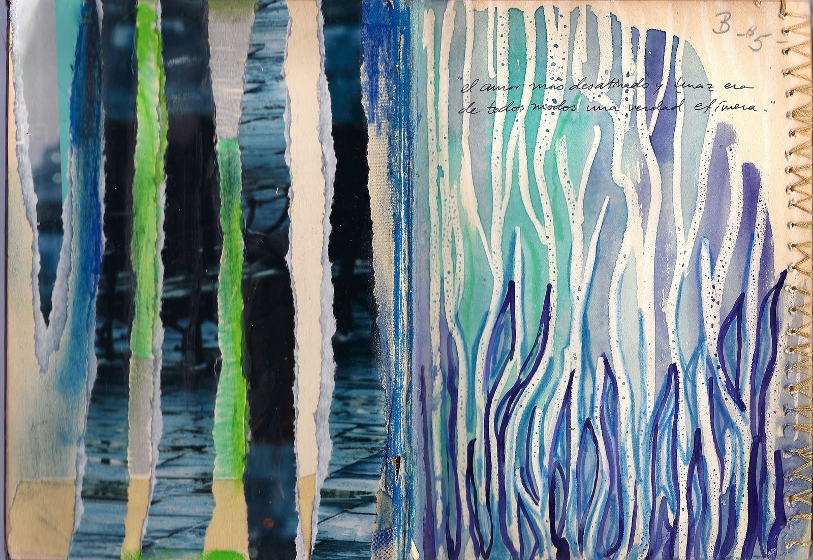
Above: Each side of this two-page spread was completed using a different background technique. On the left, I tore strips from a magazine image and glued them down vertically, leaving space for the book's paper to show through. Using metallic silver sharpie and oil pastels I added some extra color and texture in between the magazine strips. On the right side, I started by drawing vertical, organic lines with a white crayon. I then created a wax resist using a light watercolor wash of different cool colors. When this was dry I took a fine brush and applied some darker lines of watercolor paint in between the white crayon. When this was dry, I went back through with a light blue crayon to emphasize and add more depth to the pattern of lines that was emerging.
While each side is clearly made with different techniques and media, I used a similar palette and repeating vertical lines for them both so that the two pages were in harmony with one another.

Above: Using gold paint and bubble wrap I made a print on top of a light watercolor wash. Using two colors that are similar in value and hue (I chose gold and washed-out light green) I give the background pattern and texture without making it too loud or distracting. Creating a non-dominant background can be important if your next layers are subtle or detailed. You don't want anything competing with the more significant aspects of a work.

Above: A first layer created using text from the page and oil pastels. Due to vigorous blending of oil pastels, the paper became rough in parts and even started to tear. I exaggerated the tears in order to make them more deliberate design elements in this composition, thus lending more depth to these pages. This is an example of a background that is strong and expressive. The meaning of this two-page spread is really contained here, in this first layer. While I will be adding more layers to this spread, I will have to make sure that additional elements are consonant with the mood I've already created in this first layer.
Example: The Lightning Conductor

I'm posting this example from one of the books I didn't bring last week. This Wednesday we will focus on techniques for backgrounds (or first layers) and in these two pages, the background layers are easy to see despite the fact that they are complete, multi-layered pages. I'll be posting isolated examples of background techniques soon, so stay tuned.
(Double click on all images posted in this blog for an enlarged view.)
Tuesday, January 11, 2011
beginning
"my favorite thing is to go where i've never been before."
-- diane arbus
because creating an altered book is such a mixed-media, multi-faceted art form, if the process doesn't take us to new places (creatively, intellectually, personally and yes, why not, geographically) then we're probably not doing our jobs as artists to push ourselves beyond what we already know. i know i could use a good tushie-kicking, artistically speaking, to start off the new year. so 2011, jumpstart my art! class begins tomorrow. i can't wait to meet my new students.
Subscribe to:
Posts (Atom)