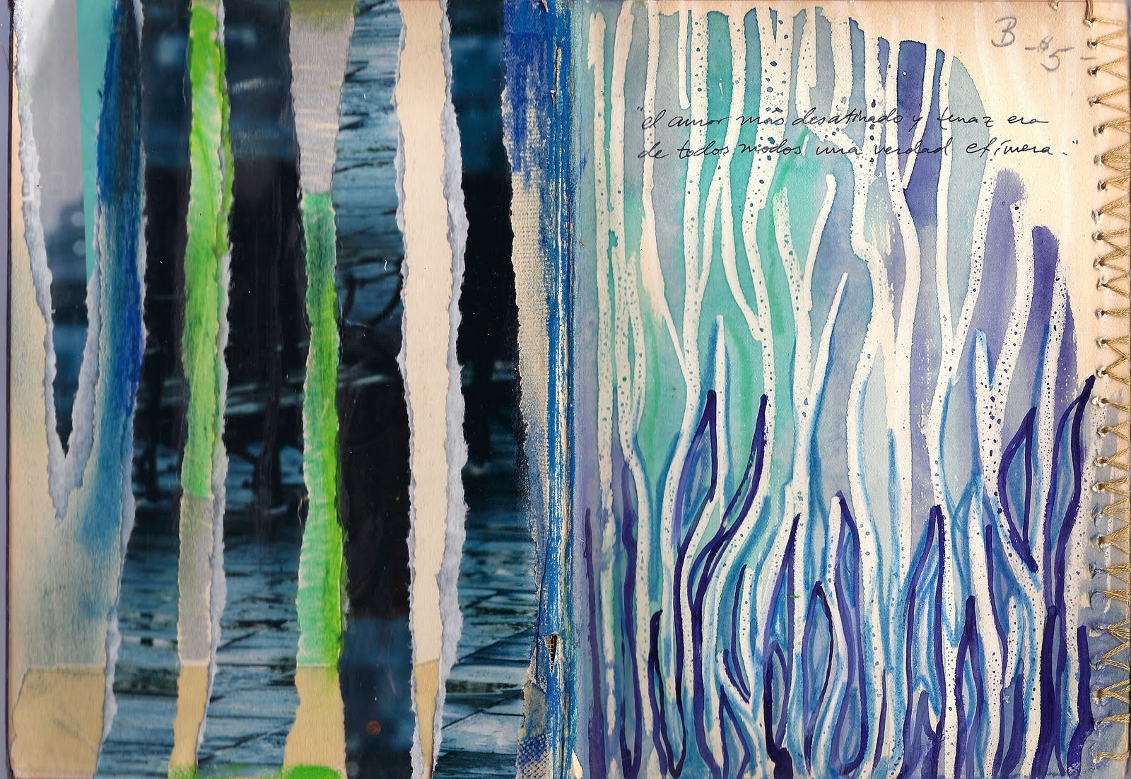
Above: Each side of this two-page spread was completed using a different background technique. On the left, I tore strips from a magazine image and glued them down vertically, leaving space for the book's paper to show through. Using metallic silver sharpie and oil pastels I added some extra color and texture in between the magazine strips. On the right side, I started by drawing vertical, organic lines with a white crayon. I then created a wax resist using a light watercolor wash of different cool colors. When this was dry I took a fine brush and applied some darker lines of watercolor paint in between the white crayon. When this was dry, I went back through with a light blue crayon to emphasize and add more depth to the pattern of lines that was emerging.
While each side is clearly made with different techniques and media, I used a similar palette and repeating vertical lines for them both so that the two pages were in harmony with one another.

Above: Using gold paint and bubble wrap I made a print on top of a light watercolor wash. Using two colors that are similar in value and hue (I chose gold and washed-out light green) I give the background pattern and texture without making it too loud or distracting. Creating a non-dominant background can be important if your next layers are subtle or detailed. You don't want anything competing with the more significant aspects of a work.

Above: A first layer created using text from the page and oil pastels. Due to vigorous blending of oil pastels, the paper became rough in parts and even started to tear. I exaggerated the tears in order to make them more deliberate design elements in this composition, thus lending more depth to these pages. This is an example of a background that is strong and expressive. The meaning of this two-page spread is really contained here, in this first layer. While I will be adding more layers to this spread, I will have to make sure that additional elements are consonant with the mood I've already created in this first layer.
No comments:
Post a Comment